Hungry Ninja Guelph
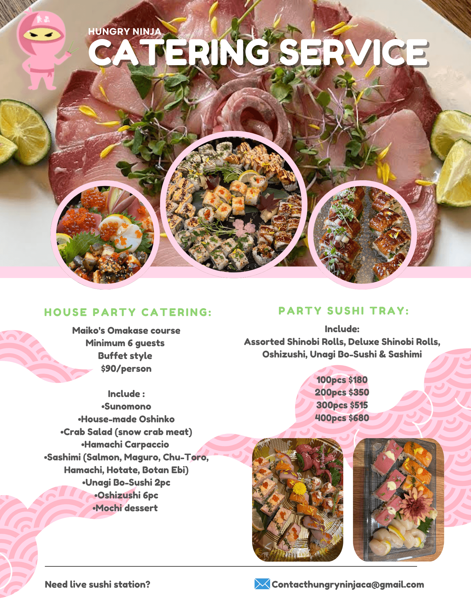
The main challenge at Hungry Ninja was that their menu was difficult for customers to read and understand, with unclear steps and no visual guidance. I took the initiative to redesign the menu, creating a clear, visually appealing layout that simplified the ordering process and incorporated helpful visuals. Making it easier for patrons to navigate options and place orders efficiently.
Graphic Design
Visual Design

Project Overview
Company: Hungry Ninja Guelph (now called Pink Ninja Izakaya)
Industry: Japanese Restaurant
Timeline: 2 weeks (2023)
My Role: Shift Lead
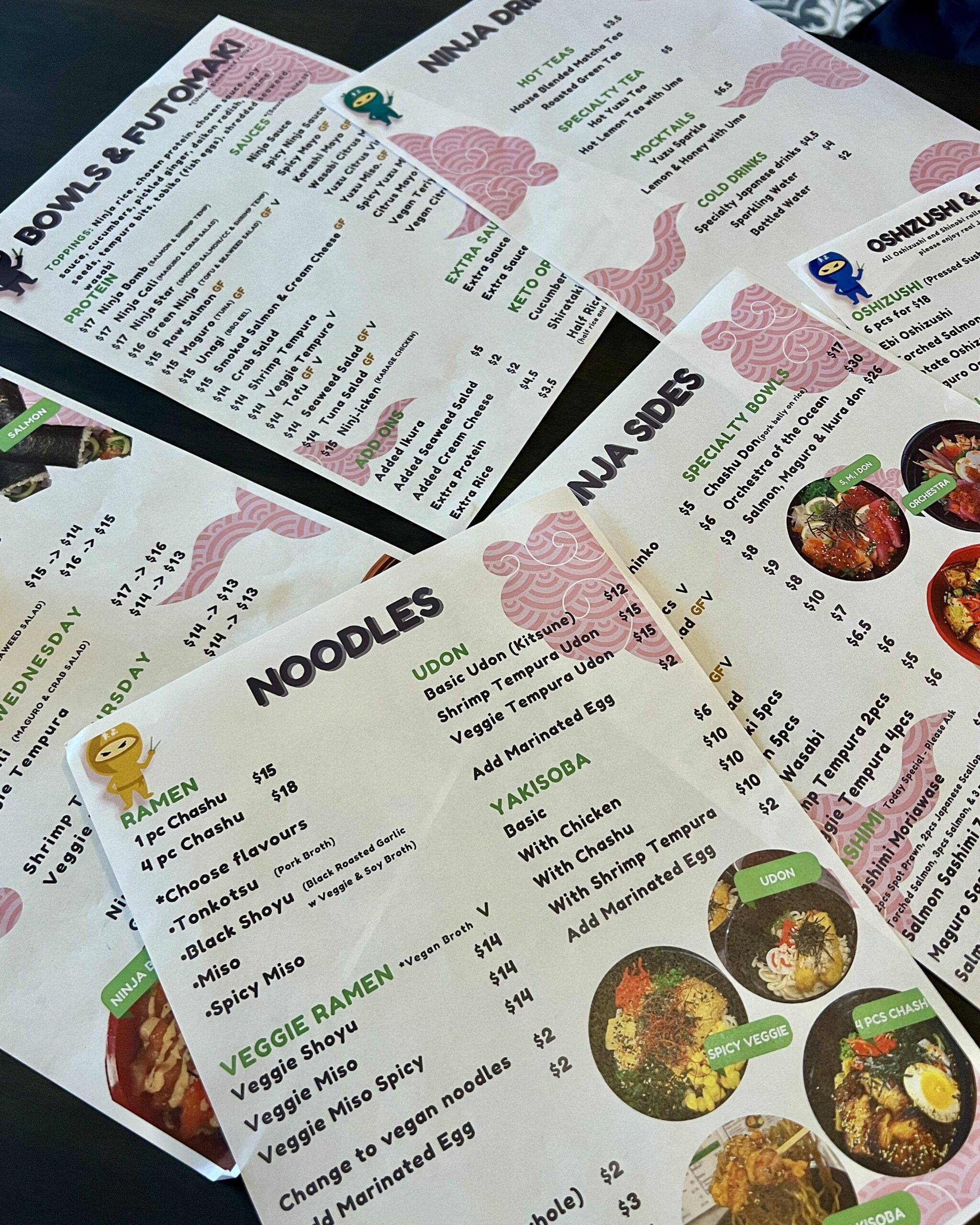
Menu Design
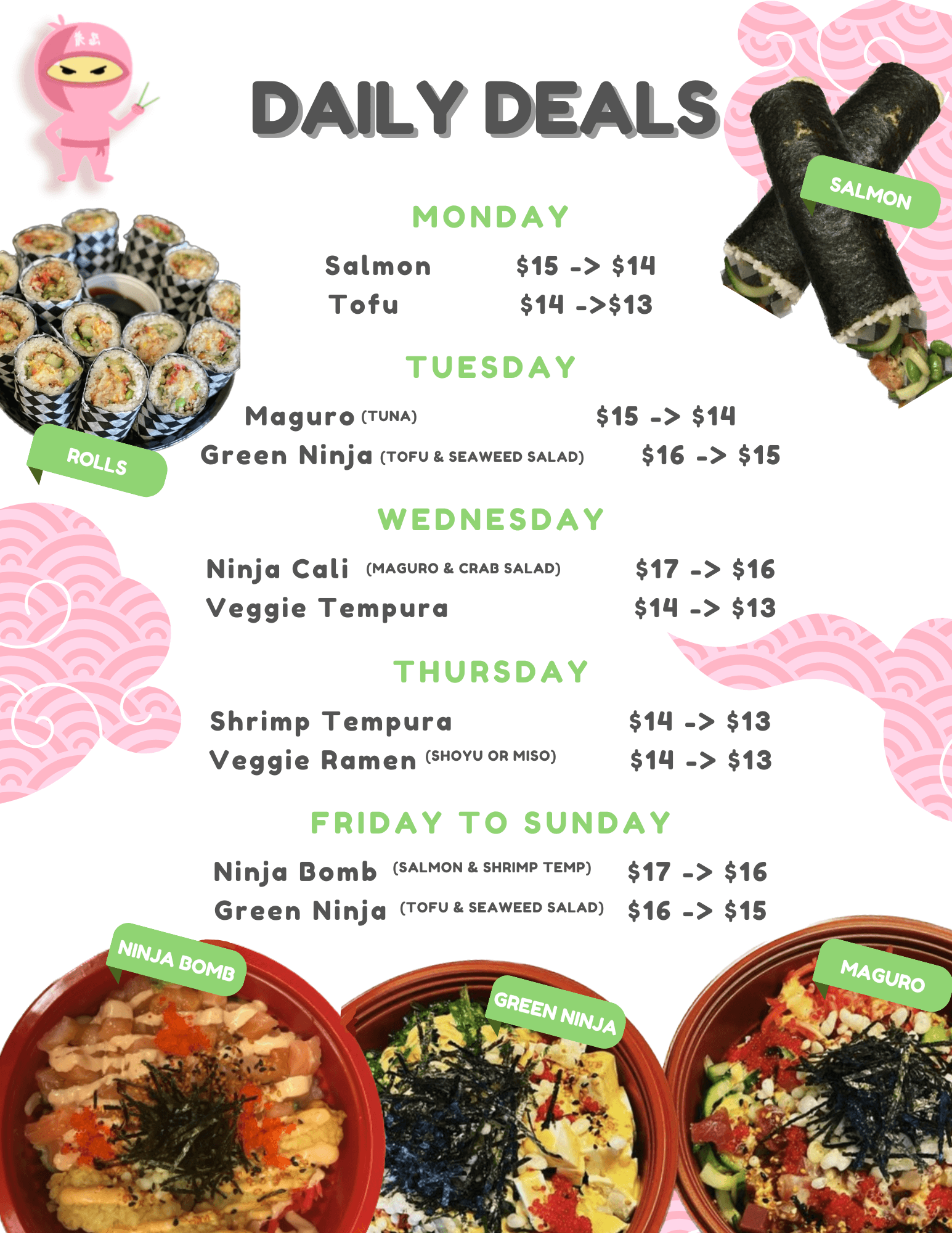
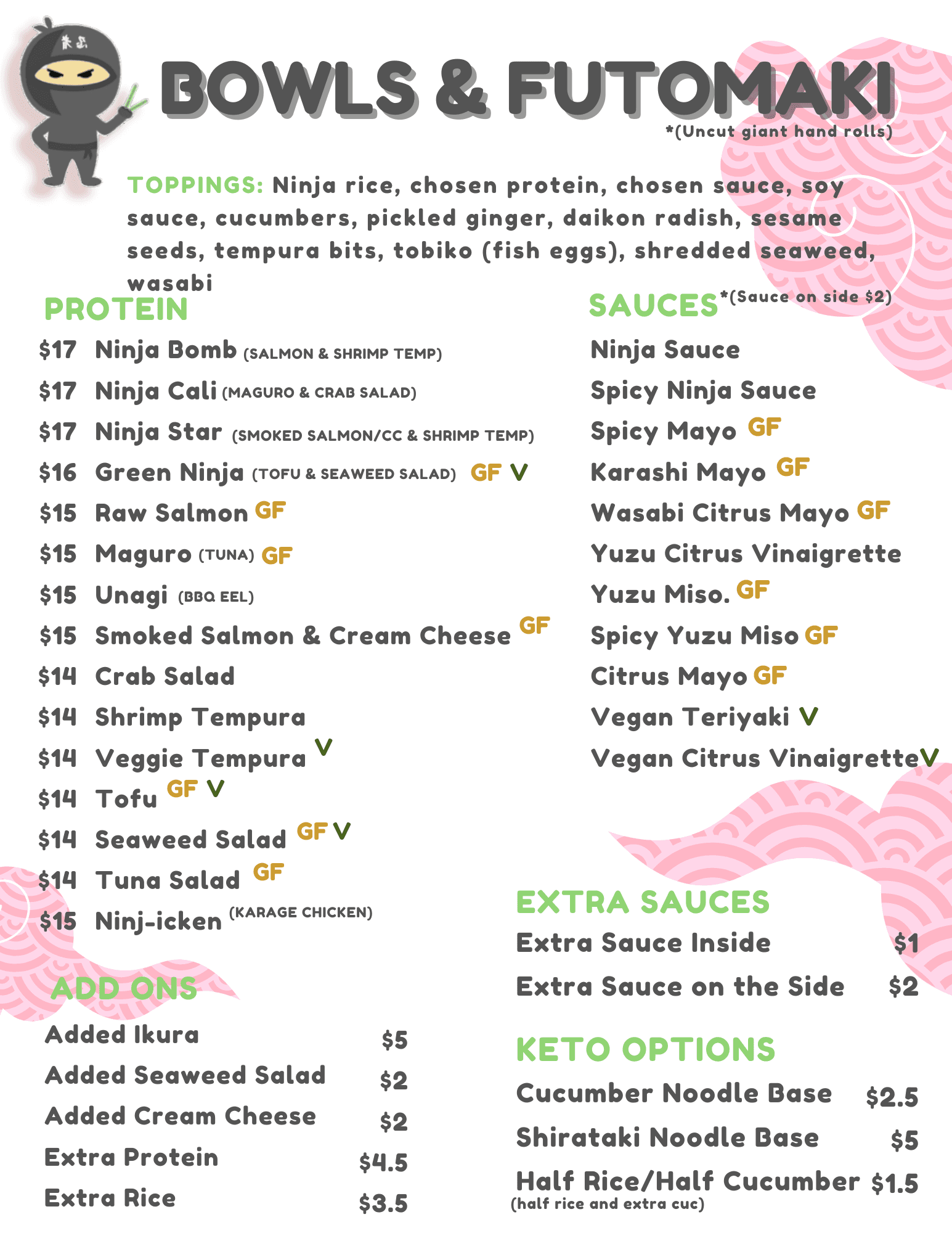
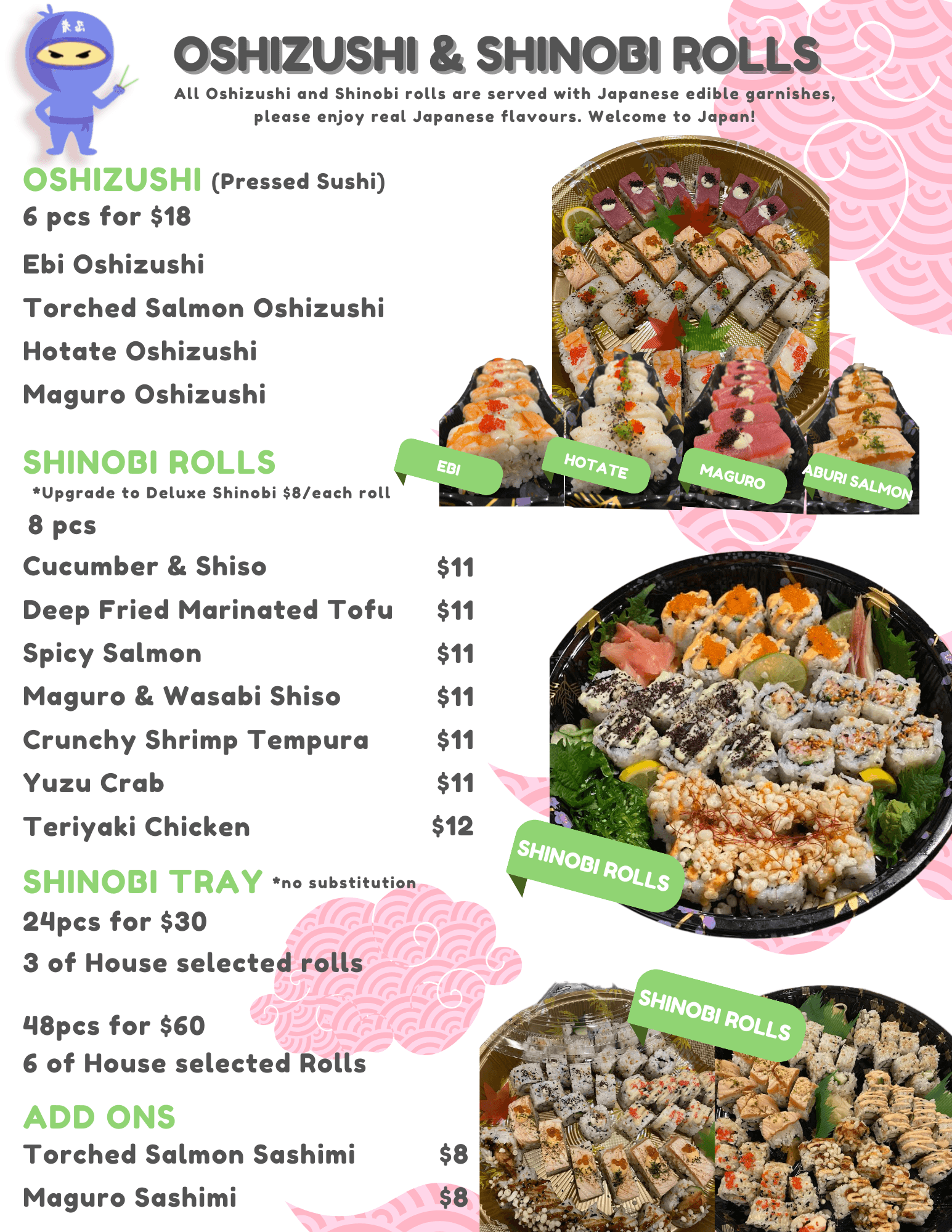
In high school, I redesigned Hungry Ninja’s menu after noticing that many customers were confused about what they were ordering due to the lack of visuals. I added images of sushi, sushi bowls, and sushi burritos to make the offerings clear and appealing. The menu features a colour palette of pink, green, and white, inspired by traditional Japanese sweets like dango, while pink clouds lines echo classic Japanese design elements. This redesign not only improved clarity for customers but also highlighted the restaurant’s Japanese heritage in a visually engaging way.
 |  |  |
 |  |  |
 |  |  |